 I’m also expecting drifts of 7-inchers. Yes, it looks like it’s going to be an Android Christmas and while many will be thinking of how filling those stockings is going to be emptying their wallets, it’s got me buzzing from a web design and SEO perspective.
In case you hadn’t noticed (and if you’ve been in-store at any point over the last few weeks, you will have) Tesco have launched their own 7″ Android tablet – the hudl. At only £119 it’s a bit of a bargain, especially as you can double up your Clubcard vouchers when buying it. With so many people saving up their vouchers for Christmas, some very family friendly styling and lots of in-store promotion, this is going to pop up in lots of letters to Santa. Tesco, being clever, are following the Amazon Kindle idea of making the device cheap and loading it with all kinds of blue-stripe links, Blinkbox and Clubcard TV, to encourage on-line shopping with them.
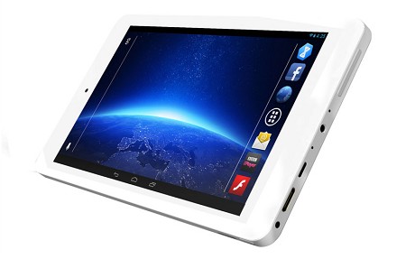
And last week Argos followed suit, pushing the price even further down with a £99.99 Bush branded tablet. Again, 7″ and, just like the hudl, Android and all the Googly goodness that entails. Knowing how many children see the laminated book of dreams as their Christmas wishlist, it’s bound to sell pretty well.
Yes, I know Apple tried to excite us with an iPad Air and Mini Retina this week, but you could afford three or four 7″ Androids for the price of one Appleslab. That makes Christmas Day a lot more harmonious.
G+et to the point, already
Anyway, what does this mean for us web designery people?
Firstly, from an SEO point of view, people may finally start seeing the impact of Google+. When you turn on your Android for the first time, you need a Google account. And then, whenever you’re using it, you’re connected. One of the stumbling blocks I’ve seen is getting people to sign up to a Google account – they don’t want a gmail.com address so they cannot see the point. Well, you don’t need a gmail.com email address to have a Google account, but you do need a Google account to start using Google+.
If we see an increase in Google+ accounts, with some clever use of +1 buttons and encouraging people to start circling each other, we’re going to see a big impact on search results. If you and your website aren’t on the Google+ bandwagon, you need to be.
It’s not the size that matters, it’s what you do with it that counts
Then we come to the popularity of the 7″ form factor. I’ve had a Nexus 7 since day one. In fact I’m on my second (had to have that 3G) and I’m sure it won’t be long before I upgrade to the “New” Nexus 7. And I cannot put it down. Far more comfortable and convenient than a 10″, most of my out-of-office browsing is done on the 7. Which means websites designed to cope with these devices are vital.
Fortunately, over at fairly marvellous, we have insisted on designing our websites “mobile first” for over a year. We build responsive websites that work brilliantly on smartphones, 7″ & 10″ tablets, laptops and desktops. If your website isn’t ready for mobile, it really has to be… soon!
And it that doesn’t convince you…
…take 2 minutes out of your busy day to watch this video (voiced by the lovely Josie, just for us!):
A Microsoft Certified Professional with many years of large corporate experience and training, he now focuses on helping small businesses make the most of their IT.
- Font Test - March 30, 2022
- An open letter of apology to Anna Firth - November 8, 2019
- My story – being a mum to a colour deficient son - September 9, 2019